A customer opens your restaurant’s online menu ready to order. Can they tell what comes with the meal, choose the right options and find out when to collect it? Your kitchen needs those answers too.
An online ordering menu has two jobs: help the guest make a clear choice and turn that choice into an accurate ticket. This checklist is for Canadian restaurant and café owners setting up direct ordering or tidying an existing menu. Start with the dishes you can reliably prepare for pickup, then test the whole journey before promoting the link.
1. Organize the menu around how guests order
Use familiar categories such as Breakfast, Sandwiches, Bowls, Drinks and Sides. Put a dish in the category a new customer would expect, rather than relying on an internal kitchen name.
For each item, confirm:
- The name tells the guest what the dish or drink is.
- The description explains the main ingredients, portion or size, and included sides.
- The price and availability match the current ordering setup.
- Any required choices appear before the item goes into the cart.
For example, “Lunch combo” leaves questions open. “Grilled sandwich with one side and a drink” tells the guest what to choose next. That is an illustrative description, not a recommendation to change your portions or pricing.
Keep breakfast-only items, seasonal specials and advance-order products on the schedules your team can actually support. A cake that needs a day’s notice should not look available for immediate pickup.
2. Make modifiers clear to guests and the kitchen
Modifiers are the choices attached to an item: size, milk, spice level, protein or an extra topping. Separate required choices from optional extras. State whether a guest can select one option or several, and show any added cost beside the option.
For a café drink, the flow might be size, hot or iced, milk, then optional extras. For a bowl, it might be protein, side and sauce. Use labels your staff will recognize on the order ticket.
Test combinations instead of checking each option in isolation. Can someone select two sizes? Does a paid extra keep its charge after editing the cart? Does “no onions” reach the kitchen?
Keep a clear contact route for allergy questions. A general order-notes box should not be your only process for handling a request the team needs to discuss with a guest.
3. Show pricing clearly before checkout
Review the advertised item price, paid options and any mandatory charges together. Guests should understand what they are paying before they commit to the order.
Canada’s Competition Bureau warns against advertising a price that customers cannot obtain because mandatory fixed fees are added later. Its guidance distinguishes government-imposed charges, such as sales tax, and notes that variable fees can also raise concerns. Read the Bureau’s drip pricing guidance when reviewing your price display.
As a practical check, add an ordinary item to the cart and explain every change between its menu price and the total. Make optional extras and delivery choices clear, and check that tax and fee labels are understandable. Early disclosure alone does not make an otherwise misleading advertised price acceptable.
4. Match pickup promises to your operation
Opening hours and ordering hours may differ. You might keep the café open while stopping kitchen orders earlier, or offer pre-orders only on selected days. Configure those distinctions deliberately.
Check the location, address, pickup instructions and preparation estimate. For multiple outlets, make sure guests know which location they have selected before paying. Give the team a way to handle busy periods and unavailable items that fits your ordering system.
Choose a quiet time for an end-to-end test. Use the system’s test mode where available; otherwise arrange a controlled order with the team. Compare the promised collection time with the ticket received by staff. Confirm who notices a new order and what happens if it cannot be fulfilled.
5. Check the menu on a phone and with a keyboard
Read the menu on a small phone screen. Item descriptions, option prices and checkout buttons should remain readable without sideways scrolling. Check whether enlarging text hides important controls.
Try moving through the order with a keyboard as well. You should be able to identify the selected option, reach the cart and understand any error message. Ask your provider to investigate controls that are hard to use.
W3C’s Web Accessibility Initiative recommends labels that identify form controls, including text fields, checkboxes and drop-downs. Its image guidance explains how text alternatives convey useful image information. In a food menu, keep essential dish details in text rather than expecting a photograph to explain them.
These are useful first checks, not a complete accessibility audit.
6. Give your website menu useful context
Your public menu page should identify the restaurant, its location and what guests can order. Use a descriptive page title and readable headings, then offer a clear route into ordering. A printable PDF can be useful alongside a readable web menu.
Google’s SEO Starter Guide recommends clear titles, organized content and descriptive links. Those principles help people and search engines understand a page; they do not guarantee a search position.
Keep public menu information consistent with the ordering menu. If you change an item or its availability, check both surfaces. Once the ordering experience is ready, use our separate guide to adding a restaurant ordering link to Google Business Profile to help guests reach it.
7. Test the whole pickup journey
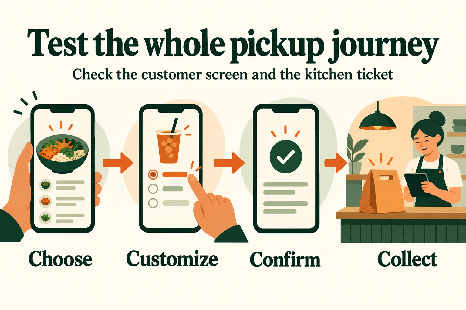
AI-generated conceptual illustration. It shows a testing workflow, not an actual Menuro screen or client.
Run one straightforward order and one with several options. Follow both through these four stages:
- Choose: Find the item, check its description and verify availability.
- Customize: Select required options, add an extra and edit the cart.
- Confirm: Check the total, location, pickup estimate and confirmation message.
- Collect: Compare the kitchen ticket with the guest’s selections and verify the handoff instructions.
Also test a sold-out item, an order outside ordering hours and a missing required choice. Record the problem, who will fix it and when you will retest. Fix anything that changes the item, total or collection location before sending more guests to the menu.
Keep one person responsible for menu updates
Assign an owner for prices, item descriptions, schedules and availability. After a change, check the customer view and a sample ticket. Ask counter staff which questions recur; those questions often reveal a description or choice that needs work.
If you are evaluating a new setup, Menuro’s online ordering solution includes website and app ordering, mobile checkout and order management with configurable prep times. Its restaurant website offering connects the public website side of the journey.
Book a Menuro demo and bring a real menu, your pickup workflow and this checklist. Ask to see how your modifiers, ordering hours and staff tickets would work, and confirm the configuration and costs for your restaurant before deciding.
Sources
Primary guidance and Menuro product pages checked on October 11, 2026:
- Competition Bureau Canada: Drip pricing
- W3C WAI: Labeling controls
- W3C WAI: Images tutorial
- Google Search Central: SEO Starter Guide
- Menuro: Online ordering and restaurant websites
The cover is an AI-generated editorial illustration, not a client photograph or product screenshot.